What do you think when you see the design below? Does it look like a professional designer put it together? Does it look like something you would feel comfortable ordering a meal from? Do you even know what it is supposed to do?
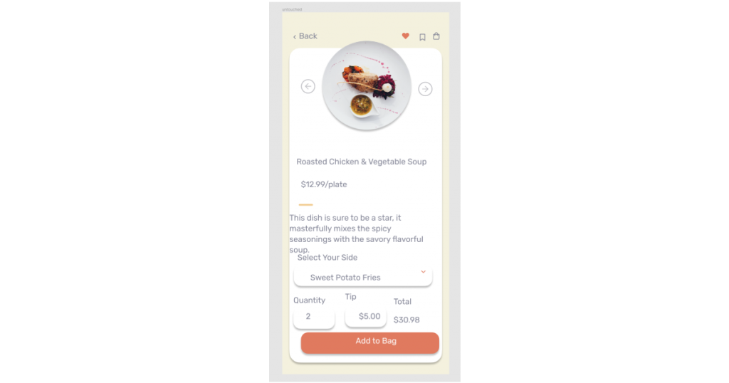
Likely not!
When we design the user interface of anything - an app, a website, even a digital game - it is a combination of many smaller pieces that creates what we see. And the smaller pieces always add up.
While this might not be news to anyone, it is worth taking time to break down UI and see what small components make major differences. Let’s take a look at 5 small tweaks we can make as designers that have a huge impact on our designs.
Alignment
What is alignment exactly? It is when elements on the design line up with each other in a given direction. Elements can align vertically, left, right or center or horizontally, top, bottom or centered. Essentially, everything in your entire design should be aligned to something else. There are some exceptions to this rule, but they are very few and far between.
Notice the example below. Despite having clear hierarchy of text, nice colors and clean images, something still just feels off. That is because the alignment is all over the place! True, this might be an extreme example. But I have seen much worse on live apps and websites before, and more often than I would expect in social media posts. The red lines are rulers, and they give you a clear example of where things should be aligned for this design to look polished.

Now look at the example after we fixed the alignment. I did not touch the colors, the typography or images. Yet it looks much more polished. This is something I would be happy to present to a client, while the example above, not so much.

How to do it - Alignment

Whether you design in Sketch, Figma, Adobe XD or something else, I am sure you have seen these icons. These are your friends. These are alignment tools. So with one click of a button, you can align everything - images, fonts, forms and groups - to each other. While it will take practice, as you design always look for instances when elements on the page would benefit from being aligned. Look at examples of work you like on Dribbble, Instagram or other platforms. Try to outline where the designer used alignment for a cleaner design and learn from their experience. Learning this crucial skill in UI design is the simplest way to clean up any design you make.
Clear Type Hierarchy
When we talk about typography, there is a lot you can do to make your designs stand out. The most important of these is understanding the importance of hierarchy, or a a graded or ranked series based on the definition found here. Basically, we as designers need to let a user glance at a design and immediately know what information is most important, what information is guiding them somewhere.
Look at the example below. While the spacing is fine, the alignment is great and the colors are mostly unchanged, what is wrong? Well, try to tell me what is important on this screen? Pretty tough isn’t it. Why? There is no visual hierarchy found in the text! Nothing that pulls my attention, no indication of what is important.

Now take a look at it after I gave it some much needed hierarchy. All of the sudden, this page is much easier to scan. I see the price is large, a heavier weight and a different color, as well as the total price. This shows me those 2 pieces of information are important! Also I see headlines are heavier, guiding my eye down the page.

How to do it - Hierarchy
There are some great plug-ins found on the various design programs that can help you build a pre-determined size list, which is great. But don’t limit yourself to that! I like to use fonts with various weights, which helps set apart important information even more from basic text. You can use color to do this as well, but a word of caution - color should never be the only distinguishing feature with copy.
Consistent Spacing
When designing UI, spacing is another thing with relatively low effort and a huge return. The goal should be to take the content on the page, group it with other elements that are connected, and use white space to communicate that.
When I say consistent spacing, I don’t mean each item on the screen should be 24px apart from each other. That would lead to elements being so consistent that they look thoughtless. We all want our designs and work to look intentional! What I DO mean though, is if your forms headline is 8px from the form in one place, you should use that pattern on all of your forms. If headlines are 16px from the paragraph under them in one place, you should again use that pattern everywhere. Paying attention to spacing patterns will help your designs in multiple ways. It will look like you paid attention to the small details, it will help elements align to each other properly and it will help give the user a clear understanding of how information is presented.
A tip for making clean UI spacing (and making it easier for pixel perfect builds) is to always space elements by a multiple of 8px. So make elements 8, 16, 24, 32, etc. px apart from each other. This lets the elements always be divisible by 2. Most design software defaults nudge amount to 10px, but I recommend overriding it to 8px.
Smart Font Usage
I hinted at this slightly in the section about text hierarchy. Using a font family with multiple weights can really make your designs come to life! A skilled designer can often use one font family for their entire app without making it boring visually! There also might be some situations where you might want to or need to use 2 different font families in one project. When and if you decide to do this, be very careful. Never use more then 2 fonts families. It is best to view one of your fonts as a main font, with the second as an accent. If you do decide to use two font families, it is also best to select one Serif font and one Sans Serif font (This is more of a suggestion, pairing similar style fonts can be done, but is much more challenging).
It is also important to understand the use case for different styles of fonts. Some fonts can lend themselves to a more playful theme. Others are more elegant and refined. Others are professional and serious. Match your font to the subject matter. A great way to do this is look at examples in the real world. Are you designing something for a kids website? Maybe opt for something slightly more playful and less serious!

Again, this example might seem extreme. But even using 3 different font families can easily lead to your designs looking unprofessional. A couple of great resources for picking and/or pairing fonts are:
- https://fonts.google.com/
- https://www.pagecloud.com/blog/best-google-fonts-pairings
- https://www.garettcreative.com/21-google-fonts-combinations-for-websites-brands/
Perfect Shadows

But they don’t have to be! Drop shadows are an essential tool for designers today, but must be done tastefully. How can you make sure your drop shadows are eye candy instead of an eye sore? Here are a couple of things that can help!
#1: NEVER use the default shadow.
Figma, Adobe XD and more all have default values when you add a drop shadow. They are not good! They are meant to be customized.
#2: Almost all of the time, don’t use true black shadows.
Changing your shadow to a dark version of colors found in the UI really ties the design together and helps it feel cohesive.
#3: Don’t use light color shadows. (Aka a light grey at 100% opacity)
When making shadows, best practice is to use dark colors with a lightened opacity. This imitates the way shadows work in real life and feels much more natural in UI.
#4: Open up the blur.
For example, Figma defaults to a 4px blur. Often times that looks harsh and unnatural. Try bringing it up to around 16 for a minimum, but remember - the larger the object, the bigger blur it typically should have.
#5: Lastly, give it a light opacity.
Drop shadows should be hinted at, almost unnoticed. This gives depth to the design without drawing undue attention to something small like a shadow.
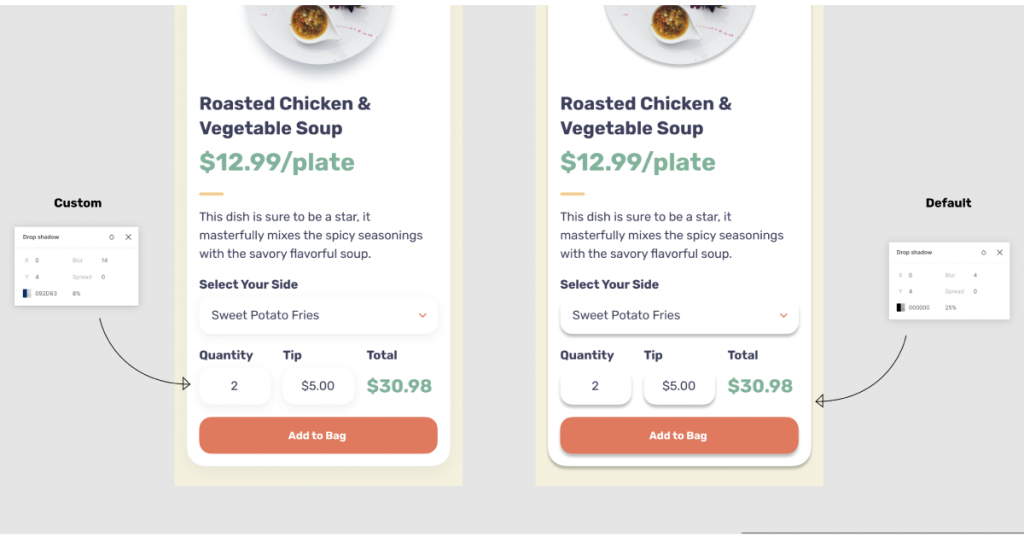
If you try a combination of these techniques, I am confident you can create a great, dynamic drop shadow. Doing so can give your UI a true depth that feels believable.
UI Improvements: Recap
It is incredible that so many small things can make a huge difference in your UI designs. In no way is this an exhaustive list, but it is a list of some of the most common errors I come across while looking at designs. So as a recap, these are 5 small UI tweaks that can have a huge impact on your designs:
Align Everything!
Not really, but make sure that you are aligning any element to something in a way that makes sense.
Make Sure to have Clear Type Hierarchy
Use sizes, single font weights and colors to present a clear hierarchy of information.
Consistent Spacing
Don’t space everything the same, but create spacing patterns that give a user a consistent experience.
Smart Font Usage
Use 1-2 font families max. When using 2 font families, view one as a main font, one as an accent.
Perfect Shadows
Adjust the opacify, shadow color and blur to add depth to your designs.
These 5 small UI improvements can make a major difference in your designs. Always try to break down work you like, figure out what about it works and how you could imitate it.
Growing as a designer is a never ending process, but attention to details like these are an essential first step to making professional and contestant work.
Need help with designing your next project or an MVP (minimum viable product)? We can help! Fill out our contact us form here to get the conversation started.


