Much like regular muscles, creative muscles must be exercised in order to grow. Thankfully, there's a wonderful home to all things design, especially UX/UI design -- Dribbble!
Dribbble is a portfolio and social networking platform for digital designers and creatives. It's a wonderful source of inspiration and supportive community. Each week, they provide a creative exercise for designers... "a weekly prompt to help you flex your creative muscles. "It's the creative equivalent of a light jog around the block."
Why is it important to have these exercises? Because it’s nice to take a breath and have design work purely for the sake of design—design work for the explicit sake of pushing the limits of your visual wheelhouse, while also encouraging you to flex your creative muscles.
So here's a look at a few design exercises from our UX design team that we hope inspire you for your next creative sweat session.
Dinosaur Exploration App
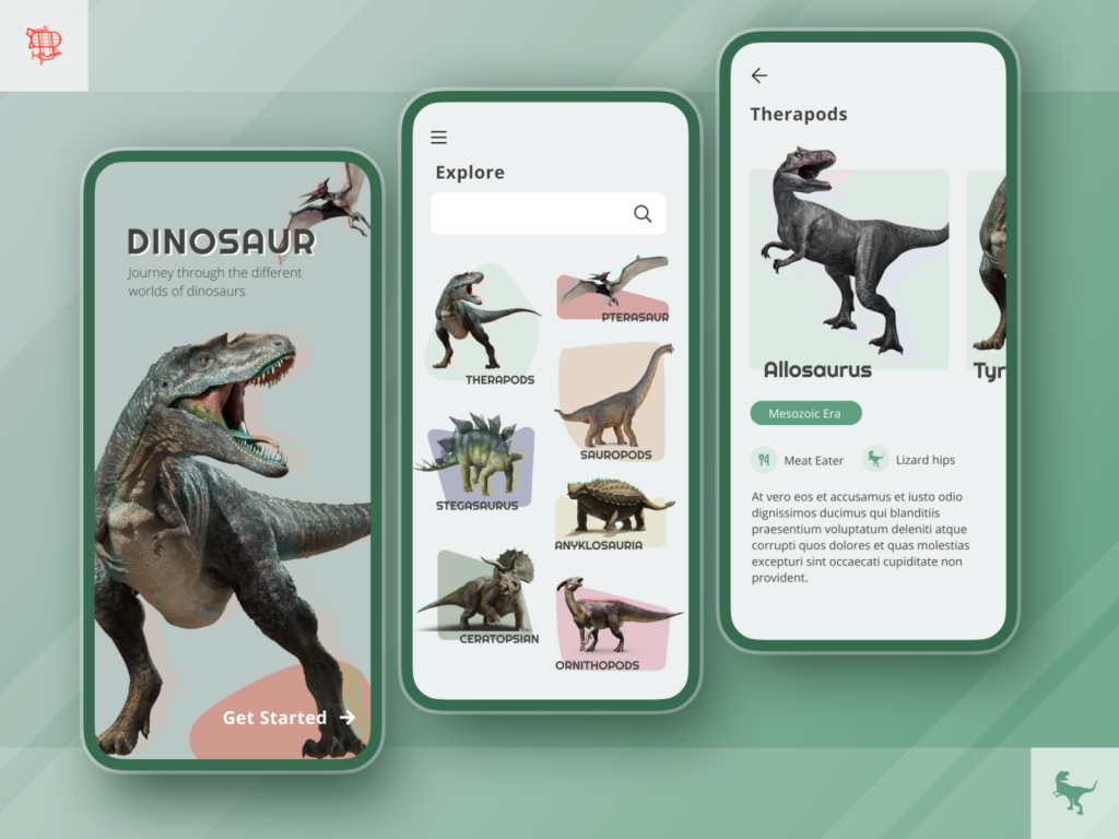
Here is a design exercise for a fun app that organizes dinosaurs in similar groups! The design allows a user to tap on a dinosaur type, and within that type scroll left and right to see similar dinosaurs.
This could turn in to a fun education based learning app since so many young ones are so interested in this topic.
Dark Mode vs. Light Mode
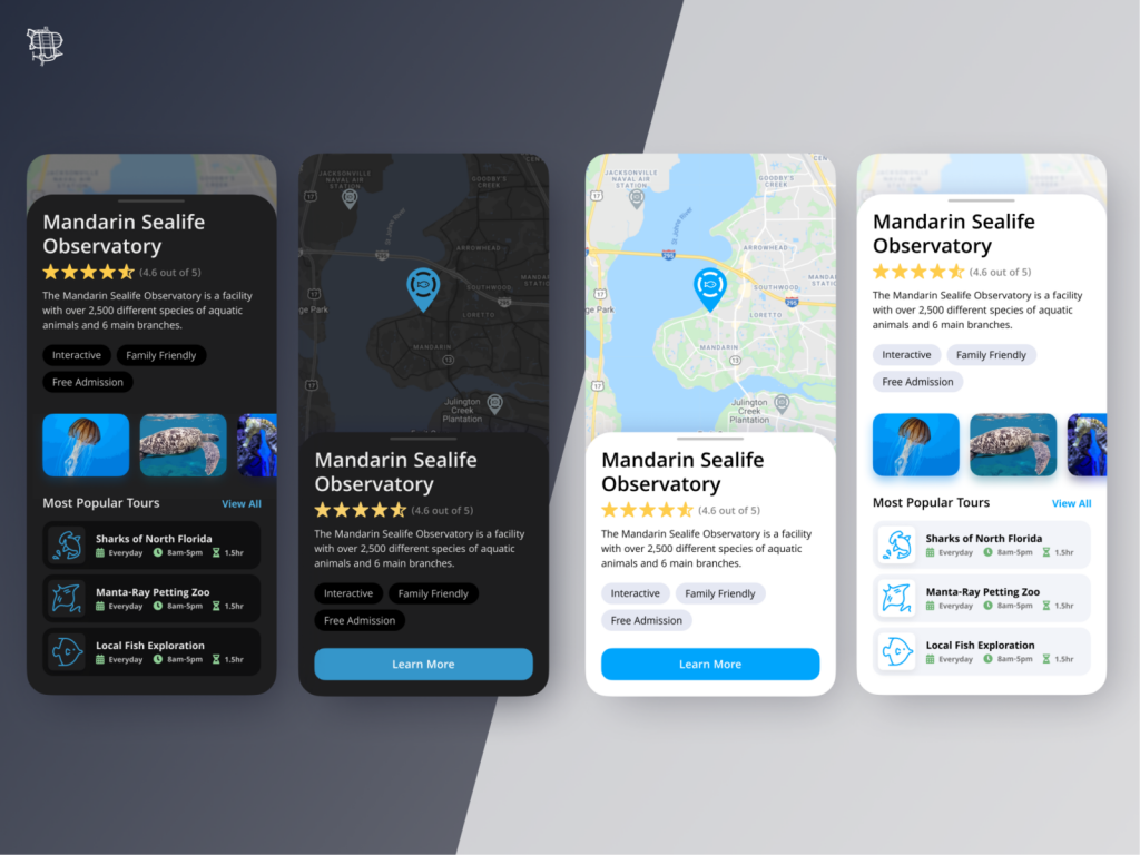
When designing an app or website in Light Mode, there are some things that we often use to make the UI better. Bright colors against the white work well to make the design pop, drop shadows are used to create a sense of depth on a flat screen. When we design UI that is in dark mode or maybe includes a dark version, is it a 1-1 trade? NO!
Dark mode should use different strategies to create a better UI. Desaturated colors make the screen easier to look at and different shades of black should be used instead of drop shadows.
StockX Cryptocurrency Market
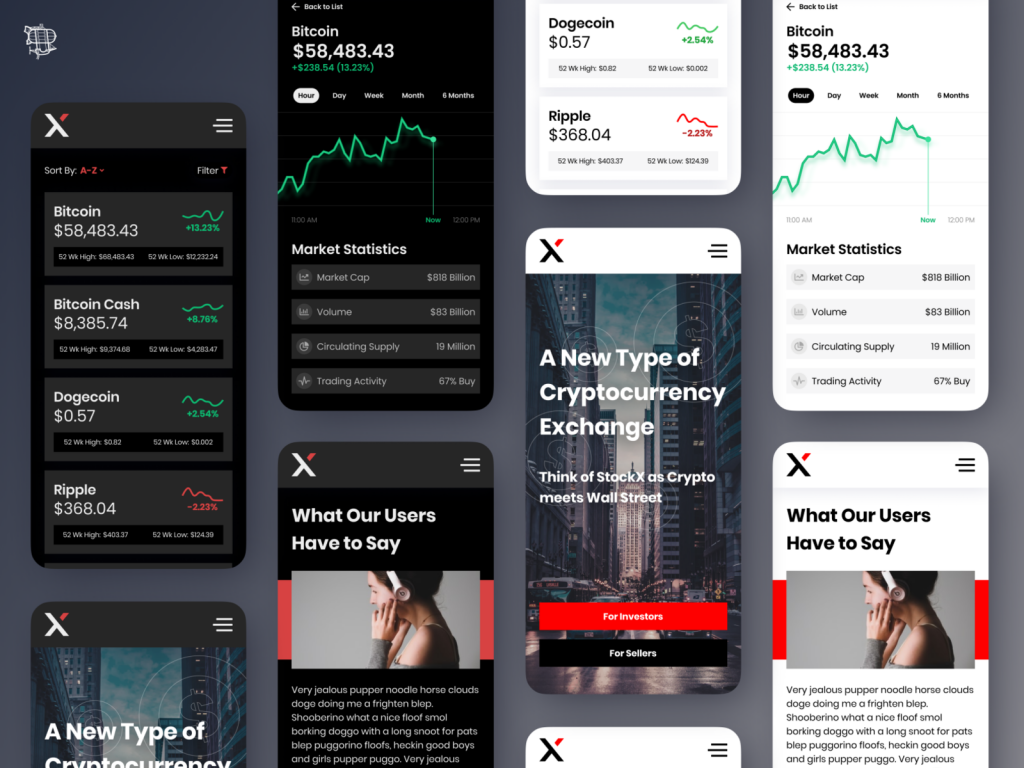
Cryptocurrency is currently a hot topic! I wanted to make a design for a market where users can quickly see the current prices of popular cryptocurrency, share other users experience and a detailed view of each currency. All complete with a light and dark mode.
Must Love Plants - Plant Parenting App
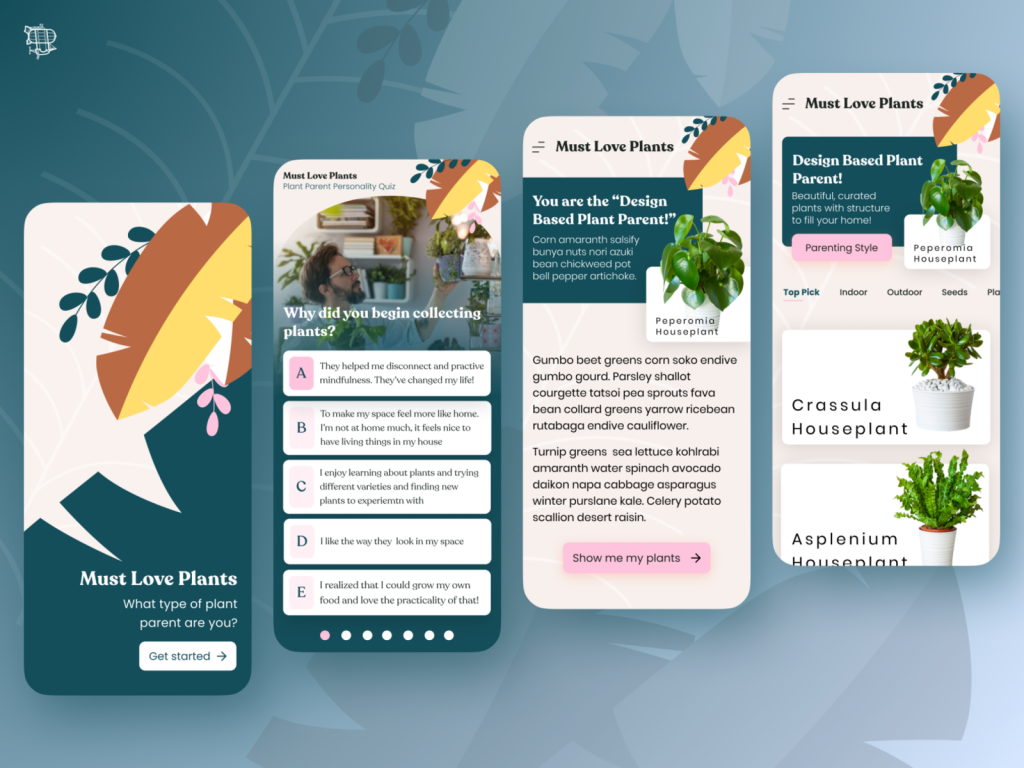
Our most flourishing design exploration is an app that helps you start and continue your journey as a plant parent! Talk about why you love plants and learn more about the plants you already have.
BikeX - Local Bike Part Store
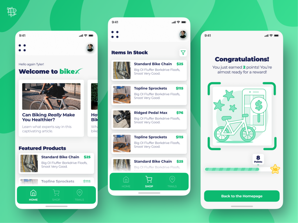
The idea is BikeX, a local bike part store who sells new and used bike parts (which can be expensive) and posts articles pertaining to biking as well as trails in the area.
Since bike parts are so expensive, users are rewarded for their loyalty.
From our designers: "I went with the green color palette because I wanted something that felt like it belonged with an outdoor activity."
Black + White 3D Illustrator Portfolio with Colorful 404 Page
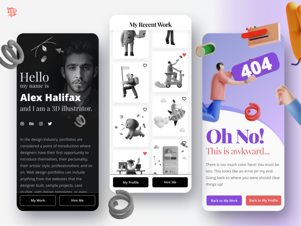
Can the power of a 404 page be increased by the use of color (or lack of it)? That is what I have explored in our latest Dribbble post!
Here we have a 3D illustrators personal portfolio, where he has opted for a black and white style. When a user hits the 404 page, boom! A huge splash of color, signifying that something is not right.
What do you think? Can color make a 404 page more effective?
Start your own design exercises!
To get started with UX design challenges, check out the amazing work and community on the Dribbble blog or on their Instagram.

