Website and software accessibility is essential for ensuring that all users, including those with disabilities, have equal access to the content and functionality. And, with 26% of American adults living with a disability according to the Centers for Disease Control and Prevention, it is important to take into account accessibility for all. There are several key elements that play a critical role in making a website or a piece of software accessible, including button styling, identifying the purpose of a link, color independence, the contrast in color and font size, and using the correct language to identify a person with a disability.
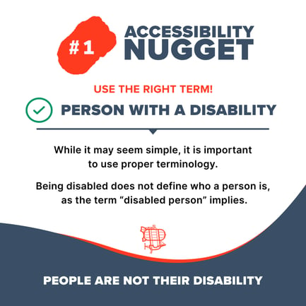
Using the correct language to identify a person with a disability is essential for website accessibility. This includes using person-first language (e.g., "person with a disability" instead of "disabled person"), avoiding stereotypes and derogatory language, and providing context for any content related to disabilities.
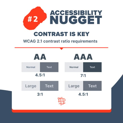
Contrast in color and font size is also essential. This includes using a minimum contrast ratio of 4.5:1 between text and background colors, ensuring that text is large enough to be easily read, and providing users with the ability to adjust the font size and color contrast.
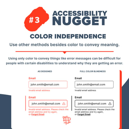
Color independence is crucial for accessibility because it ensures that users with color vision deficiencies are able to access and understand the content on a website. This includes providing sufficient contrast between text and background colors, avoiding the use of color as the only means of conveying information, and ensuring that all images have appropriate alternative text.
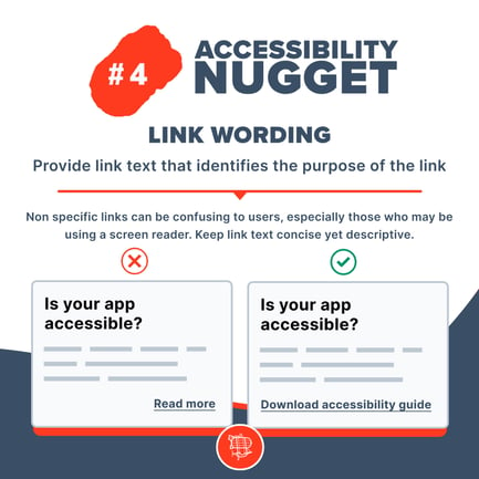
Identifying the purpose of a link is another important aspect of website or software accessibility. This includes providing clear and descriptive link text, ensuring that links are easily distinguishable from surrounding text, and providing context for the link (e.g., through the use of aria labels or title attributes).
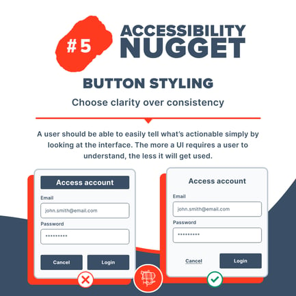
Button styling is important because it allows users to easily identify and interact with buttons. This includes using clear and descriptive labels, providing a clear indication of the button's state (e.g., hover, active, disabled), and ensuring that buttons are large enough to be easily clicked or tapped.
For additional information regarding accessibility, review the WCAG / Web Content Accessibility Guidelines and the Bureau of Internet Accessibility. The Bureau of Internet Accessibility has a newsletter that gives updates and you can enter the URL of your site for a free accessibility analysis which can give you a starting point of how best to revise your site for better accessibility for all.
In conclusion, website and software accessibility is essential for ensuring that all users, including those with disabilities, have equal access to the content and functionality. By incorporating elements such as button styling, identifying the purpose of a link, color independence, contrast in color and font size, and using the correct language to identify a person with a disability, we can create websites and software that are inclusive and accessible to everyone.


