User flows are the steps a person takes to go through an application to achieve an end goal such as making a purchase. User flows in custom software development can mean the difference between successful adoption and lower usage and a less desirable product.
5 basic reasons for the importance of user flow in custom software development include:
- Improves user experience: A well-designed user flow helps guide users through the application, making it easier for them to find what they need and complete tasks efficiently.
- Increases user engagement: A smooth and intuitive user flow can keep users engaged with the application encouraging them to return and use it more often.
- Facilitates onboarding: A clear user flow can help new users quickly understand how to navigate the application and get started using it.
- Enhances usability: By providing users with a logical and predictable path through the application, user flow can make the application more usable and reduce the need for extensive user training.
- Supports business goals: By designing user flows that align with business goals, you can ensure that users are able to complete key tasks and achieve desired outcomes, which can ultimately lead to increased revenue and customer satisfaction.
Recently, a client, Wyndy, spent some time understanding their user flows and making some changes to impact how their product is used. In the end, the tweaks they made to the user experience touched on all 5 reasons listed above. This is their story.
Wyndy - Too many user flow steps
Wyndy is a mobile app that connects parents to college-age vetted babysitters. When looking at their statistics they noticed that parents were abandoning the process of offering jobs to sitters. In an effort to increase the number of offers from parents to sitters, we started reviewing the user flow experience.
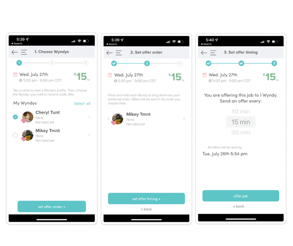
As we walked through it, we realized that the user flow process consisted of three steps on three separate screens:
- Create a job and choose your Wyndy's (sitters that are your favorites)
- Choose the order you wanted the offer to be sent - i.e. send to Julie, then Samantha, then Sara
- Choose the offer timing - i.e. if Julie doesn't respond in fifteen minutes, send it to Samantha
The solution
Our solution was two-fold. The first step was to remove the offer timing screen (image 3 above) and establish a set time of fifteen minutes in the background. Now, the parents don't have to choose a time window the offer goes to the next sitter in fifteen minutes if the first sitter hasn't responded.
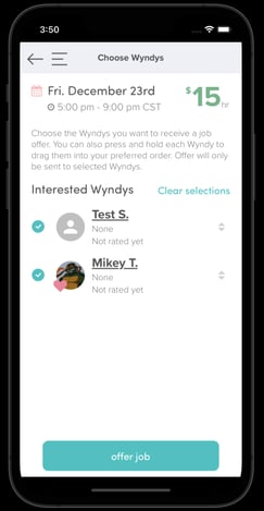
Next, we combined the two pages (images 1 and 2 above) "choose Wyndy's" and "offer order." This means you choose your Wyndy's and can reorder in what sequence you want them to be offered the role on the same screen.
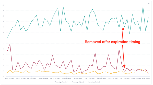
We wanted to see if offers increased for Wyndy's because what we found was the sitter would forget or not see the offer in time or the parent wouldn't follow through in time. Removing the offer timing step and ending the expiration period, saw a dramatic drop in expired offers. This means people are responding and the accepted offer percentage is going up as well. The intended result occurred!
This is the final screen.
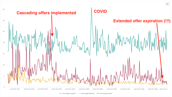
Now, for the data. These two charts show Wyndy's total offer history and another one highlights the recent changes. You can see they have made significant improvements.
 Total Offer History
Recent Changes Results
From the most recent changes a few notes:
- There has been a dramatic drop in the percentage of expired offers. In fact, it has steadily stayed under 4% since removing the offer timing step and extended expiration period.
- Overall, the accepted offer percentage has gone up as well. Still spiky due to other conditions such as an overall number of offers generated, but it's likely resulting in fewer expired jobs.
- Another unintended consequence, the percentage of rejected job offers has increased. However, this is not necessarily negative, rather than having "null feedback" because the sitter didn't engage, Wyndy now has a data point that can be further researched.
3 Simple Changes Improved User Flow
Making simple changes that combine steps and even having steps operating in the background, made the Wyndy experience better for parents and sitters. It improved experience, increased engagement, and usability. New users can navigate easily making onboarding a smoother process for new users. And, more importantly, the clean look and feel are improving business outcomes for all involved.
Understanding how a user moves through your application means constantly reviewing data and doing research.
If you have a web or mobile application that you'd like to review for user experience and design, reach out and let's talk.

